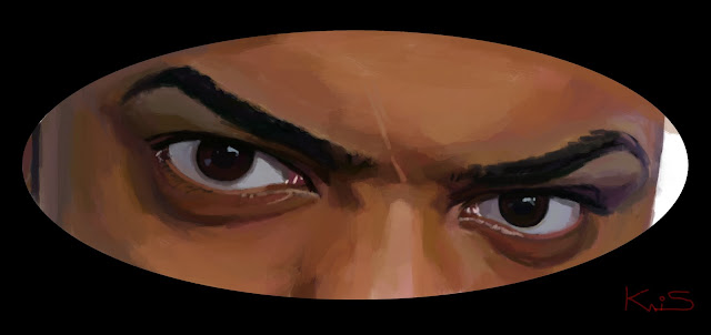
 This is a sequel to the already reworked image of an Iron man illustration I did in the summer of 09. Well even though I was happy with the over all outcome, it felt bear to me. Then I added a background. However I did not like it all that much. It felt it was a good Idea but poorly executed. Also I "edited the Image". I felt that the legs were unecessary. I wanted to put more emphasis on Ironman and the main characters. This is thee definitive one (for now.) I went over this one with a fine tooth comb to ensure success. I am very happy with it! Critques are welcomed.
P.S
This is what I love about Digital Painting you can go back and correct flaws.

No comments:
Post a Comment